|
During my data gathering journey I have discovered that my masters thesis is possible and there is quite a bit of research about the 33 Acqui massacre and tourism to Cephalonia, Greece. Through this journey I have discovered that there is data that backs up my thesis, and that my central question as to the change in continuity over time concerning tourism and the massacre of the 33rd Acqui Division on Cephalonia Greece exists, and that there is a positive correlation between tourism and the release of Captain Corellis Mandolin book in 1998 and again when the film was released in 2001. Collecting the Data Setting out to collect my data at the start was daunting, I though that no one wanted to write about the relationship between film and tourism. I quickly began to realize that quite a few business students have compiled tourist data on Cephalonia in particular and they have explored the relationship between tourism based on film portrayals. I was especially drawn to the data set in "Film tourism and destination marketing: The case of Captain Corelli’s Mandolin." By Simon Hudson and J.R. Brent Ritchie both professors of Business and Tourism from the University of Calgary, Canada. In the Journal of Vacation Marketing they explore the connections between the book and film release of Captain Corellis Mandolin and the tourist choice to come to Cephalonia. They both concluded that there is a sharp increase in British tourism to the Island of Cephalonia. Hudson and Ritchie cite an increase in tourism especially around the times both the book and film were released. They were through enough to include a table taken from the a Guardian newspaper report on Captain Corelli's Mandolin entitled "The Movie that Gave the Brits the Travel Bug" (2004) and this table visually shows the increase in tourism from 1999 to 2004. Putting the Data Together Now that I have two data sets I began by looking into how I was going to put both sets into a visual representation. This required me to learn how to use Tableau. Tableau is a system requires a .CSV file, so you must put your data into an Excel file, and this is the tedious part. Be careful to transpose your data correctly, and review what you have done, your mistakes make cost you in the end. Using Tableau Once you start to use Tableau, please follow these instructions. I found them a great place to start, but realistically just playing in Tableau is the best way to get what you want. Start by entering your data through excel, and you can either import it as an excel file or as a .CSV as the instructions say. Once you have done that select a graph you would like to use and save it. After you have saved your data set to a place you can go back to begin to play around with the buttons in Tableau. I have found that using the instructions as a guide while playing around with the different features of Tableau is the best way to explore Tableau. Simply start by pushing buttons and finding out what works and doesn't work. If you mess up or you can't get out of something, simply close Tableau, don't save your changes and reopen your base. The Finished Product Once you have your data set now is the time to take a screen shot and save your visual data. I have found that saving your data as a .PNG file, you can either try to save your work as a .PNG or simply use an online converter. Charts The charts below are the representations of the data collected from "Film tourism and destination marketing: The case of Captain Corelli’s Mandolin." The first graph is the numerical data found from their study and focuses on Tourism numbers by country to Cephalonia, Greece after the release of the book in 1998 to 2004. The Second graph is a representation of the same data by country on a map overlay. 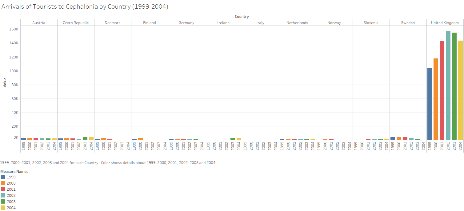 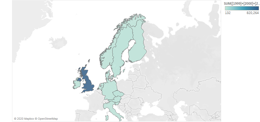
0 Comments
Leave a Reply. |
Anthony AtwoodTeacher & Researcher Archives |
 RSS Feed
